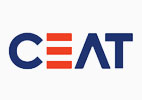
The other day, I had a closer look at the CEAT logo in one of the CEAT showrooms and was wondering what do the three horizontal lines indicate or represent in the logo. I analyzed these findings and this finding is now part of the second edition of BEE.
In the year 2008, for the first time since inception, CEAT changed its logo from the well known "Rhino" and tagline "Born Tough" to something different. The idea of "Raising the bar". This is what is reflected in the three horizontal bar which we see in the new logo. Also according to the company, the combination of orange and blue describe the mix of the youthful and contemporary worlds. E in the logo represents motion and movement.
 |
| Ceat Old Logo |
 |
| Ceat New Logo |
No comments:
Post a Comment